I. Line Item
Line items constitute most of the display & all of the functionality on a form. There are two types of line items:
1) Data collection line items and 2) Documentation line items.
Data collection line items are used to present questions to your clients and collect the answers.
There are 7 data collection line items:
1) Text Field, 2) Password Field, 3) Text Area, 4) Selection Box, 5) Check Box, 6) Radio Buttons,
and 7) File Selection.
There are two line items used strictly for documentation purposes:
1) Sub-Title and 2) Comment Line.
There are six types of line items used strictly for e-commerce (The selling of products & services online):
1) Item Selection & Quantity Lines
2) Sub Total Line
3) Sales Tax Line
4) Shipping Line (percentage)
5) Shipping Line (client selection)
6) Grand Total Line
I. Line Item - A. Quick Start
Use lines from a matching form template or one of your existing forms to accelerate your new form creation.
I. Line Item - A. Quick Start - 1. Adding (Loading) Template Lines
Form templates are prefabricated forms made up of line items that serve to collect data for a specific business or personal function.
Examples are: Job Application, User Survey, Recipe Exchange, Member Registration etc...
Procedures for adding template lines:
1) From the Form Line Item page click the button.
2) Select a form template, from the resulting list, that best matches your needs.
3) Review the selected template. If it satisfies *60% of you needs, click on the button.
* After adding a template to your form, lines may be added, updated and deleted for further customization.
Rules for Adding Templates:
1) A template may be added only when there are no other line items on your form. If you have line items on your form, they must
first be deleted before you can add a template. When there are line items on your form the button does not display.
I. Line Item - A. Quick Start - 2. Copying lines from another form
If you are creating a form that is similar to another form created by you, use the Copy Form function to get started.
The Copy Form function will load all of the lines from a selected form into your new form.
Procedures for copying form lines:
1) From the Form Line Item page click the button.
2) Select a form, from the resulting list box, that best matches your needs.
3) Click on the "Copy Form" button.
* After copying form lines to your form, lines may be added, updated and deleted for further customization.
Rules for copying form lines:
1) A form may be copied only when there are no other line items on your form. If you have line items on your form, they must
first be deleted before you can copy a form. When there are line items on your form the button does not display.
1) From the Form Line Item page click the appropriate button.
The new line being added will be placed immediately after the line where you clicked the button.
2) Select a line type from the resulting list that best matches your needs.
I. Line Item - B. Adding Lines - 1. Adding text field lines
Text field is defined as a single-line input field that can capture a relatively small answer, made up of free form text. Text field lines are items like name, amount charged, address, phone number, e-mail, salary etc... Any piece of information
that can be entered free form and the answer is not a large number of characters.
Procedures for Adding Text Field Lines:
1) Make the determination that a text field is the line type you would like to add.
2) From the Add Line Item page click the text field button.
3) Your first decision at the Add Text Field Line page is whether to create your own text field line or use one of the prefabbed samples listed below.
4) If you find a line, in the samples, similar to what you are looking for, use it. These examples are set up with the industry standards for length & edits.
5) If an adequate sample cannot be located, then you must create your own. Text fields come with several attributes that need attention:
Example: *Phone: Member's Phone Number
a. Label
A small number of words describing what information is to be collected in the text field.
In the example above the label is the word "Phone".
If no label is required or a comment line above adequately describes the field, label can be blank (not recommended).
To accomplish this simply space over the "enter label" text in the label box.
b. Bold
A check box, that when checked, will cause the label to display in bold.
c. Average # of Characters
On average how many characters will be entered into this text field.
In the example above a phone number will average about 12 characters.
d. Maximum # of Characters
What is the maximum number of characters that will ever be entered into this text field.
In the example above an international phone number might have up to 25 characters.
e. Short Comment or Help Link
A small number of words that might help further describe the field to the client.
In the example above the short comment is the "Member's Phone Number".
If a more detailed explanation is needed, enter the web address of a help page and switch
the radio button underneath to Help Link, in order to further explain the function
of this field. The following image will be displayed to you clients as a link:.
f. Required
If this switch is set to Yes, your client is required to enter some text in this text field.
Also, a red asterisk will be displayed to the left of the label indicating this is a required field.
In the example above the red asterisk to the left of the label indicates phone is a required field.
Clients will not be able to submit the form without entering a phone number.
Use this switch with caution, some fields are better left alone: e.g. every client will not have a middle initial.
g. Edits
If this switch is set to anything besides "none", it will require your client to enter text that conforms to the selected edit.
Here are the available edits:
1. Numbers Only
If this edit is invoked, clients are only able to enter numbers & 1 decimal point.
Use this with text fields like salary, price, amount, weight etc...
2. Valid Date
If this edit is invoked, clients are only able to enter a valid date in the format of MM/DD/YYYY.
MM (month) must be between 01 & 12, DD (day) must be between 01 & 31 and YYYY (year) must be four digits like 1984.
Use this with text fields like birth date, expiration date, application date etc...
3. Valid E-mail
If this edit is invoked, clients are only able to enter a valid e-mail address in the format of yourname@yourdomain.com.
E-mail is the only text field this edit should be used with.
4. Credit Card
If this edit is invoked, clients are only able to enter a valid credit card number as defined by the rules below.
a. Card number must be all numeric, No dashes no imbedded spaces.
b. Master Card numbers must begin with the number 5 and have 16 total characters.
c. Visa numbers must begin with the number 4 and have 16 total characters.
d. American Express numbers must begin with the number 3 and have 15 total characters.
e. Discover numbers must begin with the numbers 6011 and have 16 total characters.
A "Card Brand" line (selection box) will be added in addition to the credit card text line when the credit card edit is selected.
Once these attribute have been selected, click on the button to complete the addition to your form.
The password field can also be used as a security feature. If you would like to 'Password Protect' (restrict access) a form, you
may enter a password value that must be matched by your users in order for them to submit the form. Details below.
Procedures for Adding Password Lines:
1) Make the determination that a password line is the line type you would like to add.
2) From the Add Line Item page click the password field button.
3) Your first decision at the Add Password Line page is whether to create your own password line or use one of the prefabbed samples listed below.
4) If you find a line, in the samples, similar to what you are looking for, use it. These samples are set up with the industry standards for length & edits.
5) If an adequate sample cannot be located, then you must create your own. Password fields come with several attributes that need attention:
Example: *Password: Member's Password
a. Label
A small number of words describing what information is to be collected in the password field.(Usually "Password")
In the example above the label is the word "Password".
If no label is required or a comment line above adequately describes the field, label can be blank (not recommended).
To accomplish this simply space over the "enter label" text in the label box.
b. Bold
A check box, that when checked, will cause the label to display in bold.
c. Average # of Characters
On average how many characters will be entered into this password field.
In the example above a password will average about 7 characters.
d. Maximum # of Characters
What is the maximum number of characters that will ever be entered into this password field.
In the example passwords up to 10 characters are allowed.
e. Short Comment or Help Link
A small number of words that might help further describe the field to the client.
In the example above the short comment is the "Member's Password".
If a more detailed explanation is needed, enter the web address of a help page and switch
the radio button underneath to Help Link, in order to further explain the function
of this field. The following image will be displayed to you clients as a link:.
f. Required
If this switch is set to Yes, your client is required to enter a password.
Also, a red asterisk will be displayed to the left of the label indicating this is a required field.
In the example above the red asterisk to the left of the label indicates password is a required field.
Clients will not be able to submit the form without entering a password.
Once these attribute have been selected, click on the button to complete the addition to your form.
Procedures for Password Protecting your form:
1) Create Your Own Password Line then click on the button.
2) On the 'Form Security - Update Form Password' page enter a unique password.
3) Distribute this password only to users that require access to this form.
Without this password a user will not be able to submit this form.
1) Make the determination that a text area line is the line type you would like to add.
2) From the Add Line Item page click the text area field button.
3) Your first decision at the Add Text Area Line page is whether to create your own text area line or use one of the prefabbed samples listed below.
4) If you find a line, in the samples, similar to what you are looking for, use it. These samples are set up with the industry standards for length & edits.
5) If an adequate sample cannot be located, then you must create your own. Text area fields come with several attributes that need attention:
Example: *Reason for Leaving:
a. Label
A small number of words describing what information is to be collected in the text area field.
In the example above the label is the phrase "Reason for Leaving".
If no label is required or a comment line above adequately describes the field, label can be blank (not recommended).
To accomplish this simply space over the "enter label" text in the label box.
b. Bold
A check box, that when checked, will cause the label to display in bold.
c. # of Rows
A text area field looks like a box. # of rows refers to the height of the box measured in characters.
In the example above, # of rows is 5.
d. # of Columns
A text area field looks like a box. # of columns refers to the length of the box measured in characters.
In the example above, # of columns is 35.
e. Short Comment or Help Link
A small number of words that might help further describe the field to the client.
If a more detailed explanation is needed, enter the web address of a help page and switch
the radio button underneath to Help Link, in order to further explain the function
of this field. The following image will be displayed to you clients as a link:.
f. Required
If this switch is set to Yes, your client is required to enter some text in this text area field.
Also, a red asterisk will be displayed to the left of the label indicating this is a required field.
In the example above the red asterisk to the left of the label indicates "Reason for Leaving" is a required field.
Clients will not be able to submit the form without entering a Reason for Leaving.
Once these attribute have been selected, click on the button to complete the addition to your form.
1) Make the determination that a selection box line is the line type you would like to add.
2) From the Add Line Item page click the drop down selection box field button.
3) Your first decision at the Add Selection Box Line page is whether to create your own selection box line or use one of the prefabbed samples listed below.
4) If you find a line, in the samples, similar to what you are looking for, use it. These samples are set up with the industry standards for descripiton & options.
5) If an adequate sample cannot be located, then you must create your own. Selection box fields come with several attributes that need attention:
Example: *State:
a. Label
A small number of words or a question describing or being answered by the group of options in the selection box.
In the example above the label is the phrase "State".
If no label is required or a comment line above adequately describes the field, label can be blank (not recommended).
To accomplish this simply space over the "enter label" text in the label box.
b. Bold
A check box, that when checked, will cause the label to display in bold.
c. Options(Answers)
List every option to be considered under the specified label. Each line you type in this text box represents a different option.
In the example above, the word 'Alabama' is the first selection option and the first line in this box.
d. Short Comment or Help Link
A small number of words that might help further describe the field to the client.
If a more detailed explanation is needed, enter the web address of a help page and switch
the radio button underneath to Help Link, in order to further explain the function
of this field. The following image will be displayed to you clients as a link:.
e. Required
If this switch is set to Yes, your client is required to make a selection from this selection box.
Also, a red asterisk will be displayed to the left of the label indicating this is a required field.
In the example above the red asterisk to the left of the label indicates "State" is a required field.
Clients will not be able to submit the form without selecting a State.
Once these attribute have been selected, click on the button. This will take you to the selection box option page (explained in the next section).
1) Make the determination that a check box line is the line type you would like to add.
2) From the Add Line Item page click the check box field button.
3) Your first decision at the Add Check Box Line page is whether to create your own check box line or use one of the prefabbed samples listed below.
4) If you find a line, in the samples, similar to what you are looking for, use it.
5) If an adequate sample cannot be located, then you must create your own. Check Box fields come with several attributes that need attention:
Example: *Same as billing info:
a. Label
A small number of words or a question that is considered true or false, based on whether or not the checkbox is checked.
In the example above the label is the phrase "Same as billing info".
If no label is required or a comment line above adequately describes the field, label can be blank (not recommended).
To accomplish this simply space over the "enter label" text in the label box.
b. Bold
A check box, that when checked, will cause the label to display in bold. Interesting: Trying to explain this 'Bold' checkbox field in the middle of a general explanation about checkboxes.
c. Short Comment or Help Link
A small number of words that might help further describe the field to the client.
If a more detailed explanation is needed, enter the web address of a help page and switch
the radio button underneath to Help Link, in order to further explain the function
of this field. The following image will be displayed to you clients as a link:.
Once these attribute have been selected, click on the button to complete the addition to your form.
I. Line Item - B. Adding Lines - 6. Adding radio button lines
Radio buttons are like checkboxes except that they are mutually exclusive: when one is switched 'on', all others within a grouping are switched 'off'.
Procedures for Adding Radio Button Lines:
1) Make the determination that a radio button line is the line type you would like to add.
2) From the Add Line Item page click the radio button field button.
3) Your first decision at the Add Radio Button Line page is whether to create your own radio button line or use one of the prefabbed samples listed below.
4) If you find a line, in the samples, similar to what you are looking for, use it. These samples are set up with the industry standards for description & options.
5) If an adequate sample cannot be located, then you must create your own. Radio button fields come with several attributes that need attention:
Example: *U.S. Citizen?
YesNo
a. Label
A small number of words or a question describing or being answered by the group of radio button options.
In the example above the label is the phrase "U.S. Citizen?".
If no label is required or a comment line above adequately describes the field, label can be blank (not recommended).
To accomplish this simply space over the "enter label" text in the label box.
b. Bold
A check box, that when checked, will cause the label to display in bold.
c. Options(Answers)
List every option to be considered under the specified label. Each line you type in this text box represents a different option.
In the example above, the word 'Yes' is the first option to be within this radio button group and the first line in this box.
d. Short Comment or Help Link
A small number of words that might help further describe the field to the client.
If a more detailed explanation is needed, enter the web address of a help page and switch
the radio button underneath to Help Link, in order to further explain the function
of this field. The following image will be displayed to you clients as a link:.
e. Required
If this switch is set to Yes, your client is required to make a selection from this radio button group.
Also, a red asterisk will be displayed to the left of the label indicating this is a required field.
In the example above the red asterisk to the left of the label indicates "U.S. Citizen?" is a required field.
Clients will not be able to submit the form without indicating if they are a U.S. Citizen.
Once these attribute have been selected, click on the button. This will take you to the radio button option page (explained in the next section).
I. Line Item - B. Adding Lines - 7. Adding file selection lines
This input type allows the user to select files, stored on their computer, so that their contents may be submitted with a form. This included files like photos, Word documents, Excel documents etc...
Procedures for Adding File Selection Lines:
1) Make the determination that a file selection line is the line type you would like to add.
2) From the Add Line Item page click the file selections field button.
3) Your first decision at the Add File Selections Line page is whether to create your own file selection line or use one of the prefabbed samples listed below.
4) If you find a line, in the samples, similar to what you are looking for, use it.
5) If an adequate sample cannot be located, then you must create your own. File selection fields come with several attributes that need attention:
Example: *Photo Upload:
a. Label
A small number of words or a question describing the file to be uploaded.
In the example above the label is the phrase "Photo Upload".
If no label is required or a comment line above adequately describes the field, label can be blank (not recommended).
To accomplish this simply space over the "enter label" text in the label box.
b. Bold
A check box, that when checked, will cause the label to display in bold.
d. Short Comment or Help Link
A small number of words that might help further describe the field to the client.
If a more detailed explanation is needed, enter the web address of a help page and switch
the radio button underneath to Help Link, in order to further explain the function
of this field. The following image will be displayed to you clients as a link:.
e. Required
If this switch is set to Yes, your client is required to make a file selection.
Also, a red asterisk will be displayed to the left of the label indicating this is a required field.
In the example above the red asterisk to the left of the label indicates "Photo Upload" is a required field.
Clients will not be able to submit the form without selecting a photo to upload.
Once these attribute have been selected, click on the button to complete the addition to your form.
1) Make the determination that a sub-title line is the line type you would like to add.
2) From the Add Line Item page click the sub-title button.
3) Your first decision at the Add Sub-Title Line page is whether to create your own sub-title line or use one of the prefabbed samples listed below.
4) If you find a line, in the samples, similar to what you are looking for, use it.
5) If an adequate sample cannot be located, then you must create your own by entering the appropriate sub-title text.
Example:
a. sub-title text
A small number of words or a question describing the sub-title.
In the example above the sub-title text is the phrase "Billing Information".
The background color of the sub-title bar can be changed to any color in the Color Update section.
Once the sub-title text has been entered, click on the button to complete the addition to your form.
1) Make the determination that a comment line is the line type you would like to add.
2) From the Add Line Item page click the comment button.
3) Your first decision at the Add Comment Line page is whether to create your own comment line or use one of the prefabbed samples listed below.
4) If you find a line, in the samples, similar to what you are looking for, use it.
5) If an adequate sample cannot be located, then you must create your own by entering the appropriate comment text.
Example: Important Note: Address is required.
a. comment text
The actual comment you would like displayed.
Once the comment text has been entered, click on the button to complete the addition to your form.
I. Line Item - B. Adding Lines - 10. Adding Item Selection & Quantity Lines
Item selection lines are always composed of three fields:
1) Item Selection field.
This selection box will contain a brief description (and/or item number) and price of the products or services you are selling.
This field is to be populated and updated by you.
2) Quantity field.
This field is a selection box with values ranging from *Qty and 2 to 10. This field can not be changed by you.
Your user will make a selection here to indicate the quantity of product/service they wish to purchase.
*If your user selects Qty (default selection), it is the same as selecting a quantity of 1.
3) Total Amount.
This field is a text box that will display the result of multiplying the price (found in Item Selection field) by the Quantity field.
This field can not be changed by you or your user.
There is a maximum of 10 Item selection lines allowed per form.
Example: *Pizza Selection:
a. Label
A small number of words or a question describing the products to be sold.
In the example above the label is the phrase "Pizza Selection".
If no label is required or a comment line above adequately describes the field, label can be blank (not recommended).
To accomplish this simply space over the "enter label" text in the label box.
b. Bold
A check box, that when checked, will cause the label to display in bold.
c. Required
If this switch is set to Yes, your client is required to make an item selection.
Also, a red asterisk will be displayed to the left of the label indicating this is a required field.
In the example above the red asterisk to the left of the label indicates "Pizza Selection" is a required field.
Clients will not be able to submit the form without making a 'Pizza Selection'.
d. Products For Sale
List every product to be sold under the specified label. Each line you type in this text box represents a different product.
Do not enter prices in this box. Prices will be entered in the next text box named 'Product Prices'.
Each line in the 'Products For Sale' text box directly corresponds to a line in the 'Product Prices' text box, respectively.
The number of lines in these two text boxes must match.
e. Product Prices
List every corresponding price for products listed in the 'Products For Sale' text box.
Enter only numerals & a decimal point in this box. $ and other special characters are not valid.
Each line in the 'Product Prices' text box directly corresponds to a line in the 'Products For Sale' text box, respectively.
The number of lines in these two text boxes must match.
Once these attribute have been selected, click on the button to complete the addition to your form.
There is a maximum of 1 Sub-Total line allowed per form.
I. Line Item - B. Adding Lines - 12. Adding Sales Tax Line
Use this input field to calculate sales tax for customers that reside in the state of your choice.
Calculations are performed after each item selection is made and based on the percentage of your
choice. The percentage is applied to the sub-total.
There is a maximum of 1 Sales Tax line allowed per form.
Example: *Tax (AZ 8.10%):
a. Apply Tax To State
If a customer resides in this state (selected by you), then sales tax will be added to their total.
In the example above the 'Apply Tax To State' is Arizona.
b. Tax Rate
This is the rate the customer will be charged if their billing state matches the
"Apply Tax To State" you have selected.
Calculation:
1) Tax Rate is expressed as a percentage. In the example above the entry of 8.10 is equivalent to 8.1 percent.
2) Tax Rate will be applied to the form sub-total amount yielding tax amount, which will be added to the customer's grand-total.
*State Selection Box Requirement: A selection box populated with state options (spelled out; no abbreviations e.g. Arizona not AZ)
is required somewhere on the form. Otherwise, tax will not be calculated. If there is more than one state selection box, the one closest
to the top of the form will be compared to the 'Apply Tax To State' field.
I. Line Item - B. Adding Lines - 13. Adding Shipping Line (percentage)
If you would like to charge your customers for shipping as a percentage of the sub-total, select this input field.
Calculations are performed after each item selection is made and based on the percentage of your
choice. The percentage is applied to the sub-total. Tax (if applicable) is included in the sub-total.
There is a maximum of 1 Shipping line (of either type) allowed per form.
Example: *Shipping & Handling:
b. Shipping Rate
This is the rate the customer will be charged for shipping.
Calculation:
1) Shipping Rate is expressed as a percentage. An entry of 15.00 is equivalent to 15 percent.
2) Shipping Rate will be applied to the form sub-total amount (tax, if applicable, is included in the sub-total.) yielding shipping amount,
which will be added to the customer's grand-total.
I. Line Item - B. Adding Lines - 14. Adding Shipping Line (client selection)
If you would like to allow your customers to select their own appropriate shipping amount, select this input field.
Shipping is not calculated. The amount on the shipping selection is the amount that gets added to the sub-total.
Suggestion: Be very descriptive with the selections. If the selections are based on total order amount,
be sure to include the dollar ranges for each shipping price. If the selections are based on the quantity
of products ordered, be sure to include quantity ranges for each shipping price.
There is a maximum of 1 Shipping line (of either type) allowed per form.
Example: *Shipping & Handling:
a. Label
A small number of words or a question describing the shipping.
In the example above the label is the phrase "Shipping & Handling".
If no label is required or a comment line above adequately describes the field, label can be blank (not recommended).
To accomplish this simply space over the "enter label" text in the label box.
b. Bold
A check box, that when checked, will cause the label to display in bold.
c. Required
If this switch is set to Yes, your client is required to make a shipping selection.
Also, a red asterisk will be displayed to the left of the label indicating this is a required field.
In the example above the red asterisk to the left of the label indicates "Shipping & Handling" is a required field.
Clients will not be able to submit the form without making a shipping selection.
d. Shipping Selection
List every shipping alternative available to your users. Each line you type in this text box represents a different shipping alternative.
Do not enter prices in this box. Prices will be entered in the next text box named 'Shipping Prices'.
Each line in the 'Shipping Selection' text box directly corresponds to a line in the 'Shipping Prices' text box, respectively.
The number of lines in these two text boxes must match.
e. Shipping Prices
List every corresponding price for shipping alternatives listed in the 'Shipping Selection' text box.
Enter only numerals & a decimal point in this box. $ and other special characters are not valid.
Each line in the 'Shipping Prices' text box directly corresponds to a line in the 'Shipping Selection' text box, respectively.
The number of lines in these two text boxes must match.
I. Line Item - B. Adding Lines - 15. Adding Grand Total Line
Use this input field to total up your shopping cart line items, taxes & shipping. Calculations are performed after
each item selection is made. This is the amount your customers will pay.
There is a maximum of 1 Grand-Total line allowed per form.
1) From the Form Line Item page click the button for the line to be updated.
This should take you directly to the Update Line Item page.
I. Line Item - C. Updating Lines - 1. Updating text field lines
Text field is defined as a single-line input field that can capture a relatively small answer, made up of free form text. Text field lines are items like name, amount charged, address, phone number, e-mail, salary etc... Any piece of information
that can be entered free form and the answer is not a large number of characters.
Procedures for Updating Text Field Lines:
1) When you click on the , the system will make the determination that this is a text field line to be updated.
2) The systems will then display the Update Line Item page presenting the selected line with all of it's current attributes.
3) Modify any/all of the following text field attributes that need attention:
Example: *Phone: Member's Phone Number
a. Label
A small number of words describing what information is to be collected in the text field.
In the example above the label is the word "Phone".
If no label is required or a comment line above adequately describes the field, label can be blank (not recommended).
To accomplish this simply space over the "enter label" text in the label box.
b. Bold
A check box, that when checked, will cause the label to display in bold.
c. Average # of Characters
On average how many characters will be entered into this text field.
In the example above a phone number will average about 12 characters.
d. Maximum # of Characters
What is the maximum number of characters that will ever be entered into this text field.
In the example above an international phone number might have up to 25 characters.
e. Short Comment or Help Link
A small number of words that might help further describe the field to the client.
In the example above the short comment is the "Member's Phone Number".
If a more detailed explanation is needed, enter the web address of a help page and switch
the radio button underneath to Help Link, in order to further explain the function
of this field. The following image will be displayed to you clients as a link:.
f. Required
If this switch is set to Yes, your client is required to enter some text in this text field.
Also, a red asterisk will be displayed to the left of the label indicating this is a required field.
In the example above the red asterisk to the left of the label indicates phone is a required field.
Clients will not be able to submit the form without entering a phone number.
Use this switch with caution, some fields are better left alone: e.g. every client will not have a middle initial.
g. Edits
If this switch is set to anything besides "none", it will require your client to enter text that conforms to the selected edit.
Here are the available edits:
1. Numbers Only
If this edit is invoked, clients are only able to enter numbers & 1 decimal point.
Use this with text fields like salary, price, amount, weight etc...
2. Valid Date
If this edit is invoked, clients are only able to enter a valid date in the format of MM/DD/YYYY.
MM (month) must be between 01 & 12, DD (day) must be between 01 & 31 and YYYY (year) must be four digits like 1984.
Use this with text fields like birth date, expiration date, application date etc...
3. Valid E-mail
If this edit is invoked, clients are only able to enter a valid e-mail address in the format of yourname@yourdomain.com.
E-mail is the only text field this edit should be used with.
4. Credit Card
If this edit is invoked, clients are only able to enter a valid credit card number as defined by the rules below.
a. Card number must be all numeric, No dashes no imbedded spaces.
b. Master Card numbers must begin with the number 5 and have 16 total characters.
c. Visa numbers must begin with the number 4 and have 16 total characters.
d. American Express numbers must begin with the number 3 and have 15 total characters.
e. Discover numbers must begin with the numbers 6011 and have 16 total characters.
A "Card Brand" line (selection box) will be added in addition to the credit card text line when the credit card edit is selected.
Once these attributes have been modified, click on the button to complete the line modification.
The password field can also be used as a security feature. If you would like to 'Password Protect' (restrict access) a form, you
may enter a password value that must be matched by your users in order for them to submit the form. Details below.
Procedures for Updating Password Lines:
1) When you click on the , the system will make the determination that this is a password line to be updated.
2) The systems will then display the Update Line Item page presenting the selected line with all of it's current attributes.
3) Modify any/all of the following password attributes that need attention:
Example: *Password: Member's Password
a. Label
A small number of words describing what information is to be collected in the password field.(Usually "Password")
In the example above the label is the word "Password".
If no label is required or a comment line above adequately describes the field, label can be blank (not recommended).
To accomplish this simply space over the "enter label" text in the label box.
b. Bold
A check box, that when checked, will cause the label to display in bold.
c. Average # of Characters
On average how many characters will be entered into this password field.
In the example above a password will average about 7 characters.
d. Maximum # of Characters
What is the maximum number of characters that will ever be entered into this password field.
In the example passwords up to 10 characters are allowed.
e. Short Comment or Help Link
A small number of words that might help further describe the field to the client.
In the example above the short comment is the "Member's Password".
If a more detailed explanation is needed, enter the web address of a help page and switch
the radio button underneath to Help Link, in order to further explain the function
of this field. The following image will be displayed to you clients as a link:.
f. Required
If this switch is set to Yes, your client is required to enter a password.
Also, a red asterisk will be displayed to the left of the label indicating this is a required field.
In the example above the red asterisk to the left of the label indicates password is a required field.
Clients will not be able to submit the form without entering a password.
Once these attributes have been modified, click on the button to complete the line modification.
Procedures for Password Protecting your form:
1) Click on the button.
2) On the 'Form Security - Update Form Password' page enter a unique password.
3) Distribute this password only to users that require access to this form.
Without this password a user will not be able to submit this form.
4) To change the password, simple overlay the existing password with a new one and click 'Update Form Password'
1) When you click on the , the system will make the determination that this is a text area line to be updated.
2) The systems will then display the Update Line Item page presenting the selected line with all of it's current attributes.
3) Modify any/all of the following text area attributes that need attention:
Example: *Reason for Leaving:
a. Label
A small number of words describing what information is to be collected in the text area field.
In the example above the label is the phrase "Reason for Leaving".
If no label is required or a comment line above adequately describes the field, label can be blank (not recommended).
To accomplish this simply space over the "enter label" text in the label box.
b. Bold
A check box, that when checked, will cause the label to display in bold.
c. # of Rows
A text area field looks like a box. # of rows refers to the height of the box measured in characters.
In the example above, # of rows is 5.
d. # of Columns
A text area field looks like a box. # of columns refers to the length of the box measured in characters.
In the example above, # of columns is 35.
e. Short Comment or Help Link
A small number of words that might help further describe the field to the client.
If a more detailed explanation is needed, enter the web address of a help page and switch
the radio button underneath to Help Link, in order to further explain the function
of this field. The following image will be displayed to you clients as a link:.
f. Required
If this switch is set to Yes, your client is required to enter some text in this text area field.
Also, a red asterisk will be displayed to the left of the label indicating this is a required field.
In the example above the red asterisk to the left of the label indicates "Reason for Leaving" is a required field.
Clients will not be able to submit the form without entering a Reason for Leaving.
Once these attributes have been modified, click on the button to complete the line modification.
1) When you click on the , the system will make the determination that this is a selection box line to be updated.
2) The systems will then display the Update Line Item page presenting the selected line with all of it's current attributes.
3) Modify any/all of the following selection box attributes that need attention:
Example: *State:
a. Label
A small number of words or a question describing or being answered by the group of options in the selection box.
In the example above the label is the phrase "State".
If no label is required or a comment line above adequately describes the field, label can be blank (not recommended).
To accomplish this simply space over the "enter label" text in the label box.
b. Bold
A check box, that when checked, will cause the label to display in bold.
c. Options(Answers)
List every option to be considered under the specified label. Each line you type in this text box represents a different option.
In the example above, the word 'Alabama' is the first selection option and the first line in this box.
You may replace the entire box by cutting & pasting selections from a txt file or replace one line at a time.
d. Short Comment or Help Link
A small number of words that might help further describe the field to the client.
If a more detailed explanation is needed, enter the web address of a help page and switch
the radio button underneath to Help Link, in order to further explain the function
of this field. The following image will be displayed to you clients as a link:.
e. Required
If this switch is set to Yes, your client is required to make a selection from this selection box.
Also, a red asterisk will be displayed to the left of the label indicating this is a required field.
In the example above the red asterisk to the left of the label indicates "State" is a required field.
Clients will not be able to submit the form without selecting a State.
Once these attributes have been modified, click on the button to complete the line modification.
1) When you click on the , the system will make the determination that this is a check box line to be updated.
2) The systems will then display the Update Line Item page presenting the selected line with all of it's current attributes.
3) Modify any/all of the following check box attributes that need attention:
Example: *Same as billing info:
a. Label
A small number of words or a question that is considered true or false, based on whether or not the checkbox is checked.
In the example above the label is the phrase "Same as billing info".
If no label is required or a comment line above adequately describes the field, label can be blank (not recommended).
To accomplish this simply space over the "enter label" text in the label box.
b. Bold
A check box, that when checked, will cause the label to display in bold. Interesting: Trying to explain this 'Bold' checkbox field in the middle of a general explanation about checkboxes.
c. Short Comment or Help Link
A small number of words that might help further describe the field to the client.
If a more detailed explanation is needed, enter the web address of a help page and switch
the radio button underneath to Help Link, in order to further explain the function
of this field. The following image will be displayed to you clients as a link:.
Once these attributes have been modified, click on the button to complete the line modification.
I. Line Item - C. Updating Lines - 6. Updating radio button lines
Radio buttons are like checkboxes except that they are mutually exclusive: when one is switched 'on', all others within a grouping are switched 'off'.
Procedures for updating Radio Button Lines:
1) When you click on the , the system will make the determination that this is a radio button line to be updated.
2) The systems will then display the Update Line Item page presenting the selected line with all of it's current attributes.
3) Modify any/all of the following radio button attributes that need attention:
Example: *U.S. Citizen?
YesNo
a. Label
A small number of words or a question describing or being answered by the group of radio button options.
In the example above the label is the phrase "U.S. Citizen?".
If no label is required or a comment line above adequately describes the field, label can be blank (not recommended).
To accomplish this simply space over the "enter label" text in the label box.
b. Bold
A check box, that when checked, will cause the label to display in bold.
c. Options(Answers)
List every option to be considered under the specified label. Each line you type in this text box represents a different radio button option.
In the example above, the word 'Yes' is the first radio button option and the first line in this box.
You may replace the entire box by cutting & pasting radio button options from a txt file or replace one line at a time.
d. Short Comment or Help Link
A small number of words that might help further describe the field to the client.
If a more detailed explanation is needed, enter the web address of a help page and switch
the radio button underneath to Help Link, in order to further explain the function
of this field. The following image will be displayed to you clients as a link:.
e. Required
If this switch is set to Yes, your client is required to make a selection from this radio button group.
Also, a red asterisk will be displayed to the left of the label indicating this is a required field.
In the example above the red asterisk to the left of the label indicates "U.S. Citizen?" is a required field.
Clients will not be able to submit the form without indicating if they are a U.S. Citizen.
Once these attributes have been modified, click on the button to complete the line modification.
I. Line Item - C. Updating Lines - 7. Updating file selection lines
This input type allows the user to select files, stored on their computer, so that their contents may be submitted with a form. This included files like photos, Word documents, Excel documents etc...
Procedures for updating File Selection Lines:
1) When you click on the , the system will make the determination that this is a file selection line to be updated.
2) The systems will then display the Update Line Item page presenting the selected line with all of it's current attributes.
3) Modify any/all of the following file selection attributes that need attention:
Example: *Photo Upload:
a. Label
A small number of words or a question describing the file to be uploaded.
In the example above the label is the phrase "Photo Upload".
If no label is required or a comment line above adequately describes the field, label can be blank (not recommended).
To accomplish this simply space over the "enter label" text in the label box.
b. Bold
A check box, that when checked, will cause the label to display in bold.
d. Short Comment or Help Link
A small number of words that might help further describe the field to the client.
If a more detailed explanation is needed, enter the web address of a help page and switch
the radio button underneath to Help Link, in order to further explain the function
of this field. The following image will be displayed to you clients as a link:.
e. Required
If this switch is set to Yes, your client is required to make a file selection.
Also, a red asterisk will be displayed to the left of the label indicating this is a required field.
In the example above the red asterisk to the left of the label indicates "Photo Upload" is a required field.
Clients will not be able to submit the form without selecting a photo to upload.
Once these attributes have been modified, click on the button to complete the line modification.
1) When you click on the , the system will make the determination that this is a sub-title line to be updated.
2) The systems will then display the Update Line Item page presenting the selected line with all of it's current attributes.
3) Modify any/all of the following sub-title attributes that need attention:
Example:
a. sub-title text
A small number of words or a question describing the sub-title.
In the example above the sub-title text is the phrase "Billing Information".
The background color of the sub-title bar can be changed to any color in the Color Update section.
Once the sub-title text has been updated, click on the button to complete the line modification.
1) When you click on the , the system will make the determination that this is a comment line to be updated.
2) The systems will then display the Update Line Item page presenting the selected line with all of it's current attributes.
3) Modify any/all of the following comment attributes that need attention:
Example: Important Note: Address is required.
a. comment text
The actual comment you would like displayed.
Once the comment text has been updated, click on the button to complete the line modification.
I. Line Item - C. Updating Lines - 10. Updating Item Selection & Quantity Lines
Item selection lines are always composed of three fields:
1) Item Selection field.
This selection box will contain a brief description (and/or item number) and price of the products or services you are selling.
This field is to be populated and updated by you.
2) Quantity field.
This field is a selection box with values ranging from *Qty and 2 to 10. This field can not be changed by you.
Your user will make a selection here to indicate the quantity of product/service they wish to purchase.
*If your user selects Qty (default selection), it is the same as selecting a quantity of 1.
3) Total Amount.
This field is a text box that will display the result of multiplying the price (found in Item Selection field) by the Quantity field.
This field can not be changed by you or your user.
There is a maximum of 10 Item selection lines allowed per form.
Example: *Pizza Selection:
a. Label
A small number of words or a question describing the products to be sold.
In the example above the label is the phrase "Pizza Selection".
If no label is required or a comment line above adequately describes the field, label can be blank (not recommended).
To accomplish this simply space over the "enter label" text in the label box.
b. Bold
A check box, that when checked, will cause the label to display in bold.
c. Required
If this switch is set to Yes, your client is required to make an item selection.
Also, a red asterisk will be displayed to the left of the label indicating this is a required field.
In the example above the red asterisk to the left of the label indicates "Pizza Selection" is a required field.
Clients will not be able to submit the form without making a 'Pizza Selection'.
d. Products For Sale
List every product to be sold under the specified label. Each line you type in this text box represents a different product.
Do not enter prices in this box. Prices will be entered in the next text box named 'Product Prices'.
Each line in the 'Products For Sale' text box directly corresponds to a line in the 'Product Prices' text box, respectively.
The number of lines in these two text boxes must match.
You may replace the entire box by cutting & pasting 'Products For Sale' options from a txt file or replace one line at a time.
e. Product Prices
List every corresponding price for products listed in the 'Products For Sale' text box.
Enter only numerals & a decimal point in this box. $ and other special characters are not valid.
Each line in the 'Product Prices' text box directly corresponds to a line in the 'Products For Sale' text box, respectively.
The number of lines in these two text boxes must match.
Once these attribute have been selected, click on the button to complete the addition to your form.
I. Line Item - C. Updating Lines - 11. Updating Sales Tax Line
Use this input field to calculate sales tax for customers that reside in the state of your choice.
Calculations are performed after each item selection is made and based on the percentage of your
choice. The percentage is applied to the sub-total.
There is a maximum of 1 Sales Tax line allowed per form.
Example: *Tax (AZ 8.10%):
a. Apply Tax To State
If a customer resides in this state (selected by you), then sales tax will be added to their total.
In the example above the 'Apply Tax To State' is Arizona.
b. Tax Rate
This is the rate the customer will be charged if their billing state matches the
"Apply Tax To State" you have selected.
Calculation:
1) Tax Rate is expressed as a percentage. In the example above the entry of 8.10 is equivalent to 8.1 percent.
2) Tax Rate will be applied to the form sub-total amount yielding tax amount, which will be added to the customer's grand-total.
*State Selection Box Requirement: A selection box populated with state options (spelled out; no abbreviations e.g. Arizona not AZ)
is required somewhere on the form. Otherwise, tax will not be calculated. If there is more than one state selection box, the one closest
to the top of the form will be compared to the 'Apply Tax To State' field.
I. Line Item - C. Updating Lines - 12. Updating Shipping Line (percentage)
If you would like to charge your customers for shipping as a percentage of the sub-total, select this input field.
Calculations are performed after each item selection is made and based on the percentage of your
choice. The percentage is applied to the sub-total. Tax (if applicable) is included in the sub-total.
There is a maximum of 1 Shipping line (of either type) allowed per form.
Example: *Shipping & Handling:
b. Shipping Rate
This is the rate the customer will be charged for shipping.
Calculation:
1) Shipping Rate is expressed as a percentage. An entry of 15.00 is equivalent to 15 percent.
2) Shipping Rate will be applied to the form sub-total amount (tax, if applicable, is included in the sub-total.) yielding shipping amount,
which will be added to the customer's grand-total.
Important Note: Shipping Line (percentage) & Shipping Line (client selection) are mutually exclusive. If you now have opted to use the other type,
you must first delete the existing shipping line, then add the shipping type of your choice.
I. Line Item - C. Updating Lines - 13. Updating Shipping Line (client selection)
If you would like to allow your customers to select their own appropriate shipping amount, select this input field.
Shipping is not calculated. The amount on the shipping selection is the amount that gets added to the sub-total.
Suggestion: Be very descriptive with the selections. If the selections are based on total order amount,
be sure to include the dollar ranges for each shipping price. If the selections are based on the quantity
of products ordered, be sure to include quantity ranges for each shipping price.
There is a maximum of 1 Shipping line (of either type) allowed per form.
Example: *Shipping & Handling:
a. Label
A small number of words or a question describing the shipping.
In the example above the label is the phrase "Shipping & Handling".
If no label is required or a comment line above adequately describes the field, label can be blank (not recommended).
To accomplish this simply space over the "enter label" text in the label box.
b. Bold
A check box, that when checked, will cause the label to display in bold.
c. Required
If this switch is set to Yes, your client is required to make a shipping selection.
Also, a red asterisk will be displayed to the left of the label indicating this is a required field.
In the example above the red asterisk to the left of the label indicates "Shipping & Handling" is a required field.
Clients will not be able to submit the form without making a shipping selection.
d. Shipping Selection
List every shipping alternative available to your users. Each line you type in this text box represents a different shipping alternative.
Do not enter prices in this box. Prices will be entered in the next text box named 'Shipping Prices'.
Each line in the 'Shipping Selection' text box directly corresponds to a line in the 'Shipping Prices' text box, respectively.
The number of lines in these two text boxes must match.
e. Shipping Prices
List every corresponding price for shipping alternatives listed in the 'Shipping Selection' text box.
Enter only numerals & a decimal point in this box. $ and other special characters are not valid.
Each line in the 'Shipping Prices' text box directly corresponds to a line in the 'Shipping Selection' text box, respectively.
The number of lines in these two text boxes must match.
Important Note: Shipping Line (percentage) & Shipping Line (client selection) are mutually exclusive. If you now have opted to use the other type,
you must first delete the existing shipping line, then add the shipping type of your choice.
1) From the Form Line Item page click the button of the line to be deleted.
This will take you back to the Form Line Item page after first deleting the selected line.
When attempting to delete a line you will receive a pop-up warning below:
2) To delete one line or multiple selected lines, from the Form Line Item page, check the
checkbox of the line(s) to be deleted. Then click the
'Delete Checked Lines/Re-Sequence All Lines' button at the bottom of the page.
When attempting to delete a line you will receive a pop-up warning below:
"WARNING: Are you sure you want to delete and/or re-sequence these lines?"
In other words, deleting a field, from a form in which clients have entered data, makes the data collected by the field inaccessible.
Example. I have a form defined as follows:
Membership Form
Name Street Address Phone Number
I have three clients that have entered the following data:
John 23 N Main Lane 602-923-2500
Jeff 113 W Grove St 602-526-2520
Mark 40 N 1140th st 602-553-2230
If I delete Street Address the data will look like this:
Name Phone Number
John 602-923-2500
Jeff 602-526-2520
Mark 602-553-2230
As you can see the Street Address data is gone forever.
I. Line Item - D. Deleting/Re-Sequencing Lines - 2. Deleting All Lines on a Form
From the Form Line Item page towards the bottom right-hand side of the page select 'Check All'
in the Check Lines: selection box.
Then click on the button located just above the 'Check Lines' box.
This will take you back to the Form Line Item page after first deleting all lines on the form.
When attempting to delete all lines you will receive a pop-up warning stating:
"WARNING: Are you sure you want to delete and/or re-sequence these lines?"
Be very cautious with this function, any and all data entered by your clients, using this form, will be lost.
I. Line Item - D. Deleting/Re-Sequencing Lines - 3. Re-Sequencing All Lines on a Form
Change the order in which the lines are displayed by manipulating the line sequence fields in the right most column of
Form Line Item page. Then click on the button located at the bottom right-hand side of the page.
This will take you back to the Form Line Item page after first re-sequencing all lines on the form.
When attempting to re-sequence all lines you will receive a pop-up warning stating:
"WARNING: Are you sure you want to delete and/or re-sequence these lines?"
Be very cautious with this function, if any line item checkboxes are checked, those line items will be deleted.
I. Line Item - E. Client Identity Field
A client identity field is an element that helps you distinguish one client's data from another. Fields such as e-mail, name, phone and social security number help to uniquely identify your client.
We suggest that you always include client e-mail on all your forms. Not only as a client identity field but also as a means of contacting your client.
II. Form Page Layout
Form Page Layout is a comprehensive menu of functions that may be performed to maximize the customization of your form.
The menu includes Full Page Display, Line Item Edit, Title Update, Page Style, Image Update, Color Update & Form Complete.
All but two of these menu options are explained in a sub-section below. Line Item Edit is explained in it's own section
I. Line Item. The Form Complete option
should be used when all aspects of your form (Lines, Images, Title & Color) have been customized to your satisfaction.
Form Page Layout also displays the look and feel of your form. The form along with all it's modifications (if any) will be displayed
below a solid black line labeled "Form begins below this bar". Except for the image positions not used ( e.g. [ Image 1 ] ),
this form display is what the clients will see. The Full Page Display Option will show exactly what the client will
see in it's own pop-up window with image positions, not used, showing as blank.
II. Form Page Layout - A. Page Style
Page style helps to customize your form by simulating the basic structure of your native web site pages. There are currently 5 page styles to
choose from. Select the one that most closely matches the structure of your web pages. The idea is to have your client feel
like they have not left your site when they get to one of our form pages. Click on one of the page style links below (pop-up window) and
follow along as we walk through the components of a page style.
Page style can be updated at any time. From the Main Menu click '3. Edit Existing Forms' then from the 'Form Page Layout' page
click the 'Page Style' button. Change the page style and click the "Update Page Style & Title' button.
A) [ Image # ] - This indicates where an image (company logo, photo, picture etc...) of your choosing will reside on the page.
Choose a page style where the [ Image # ] are located on the page where you would like your images to appear.
During the form creation process you will be directed to select images to replace the [ Image # ] on the page. If
no image is selected, nothing will be displayed in that position to your clients.
For more info go to B. Image Update.
B) [ Title ] - This refers to the position of where the form title will reside on the page. During the form creation process you will be asked to come up with a title for your form. It will be positioned where the [ Title ] is located on the page.
For more info go to D. Title.
C) [ Color # ] - This refers to the color of the associated [ Title ]. During the form creation process you will be directed to select a custom color for the [ Title ] field.
For more info go to C. Color Update.
D) [ Color # - background ] - This refers to the background color of the shaded area in the position where the [ Color # - background ]
is found. During the form creation process you will be directed to select custom colors to fill in the shaded area (labeled by [ Color # - background ] ).
For more info go to C. Color Update.
Note: If the existing page styles do not satisfy your needs, please send us a new format and we will consider it for addition.
For 100% complete customization, consider creating a form page using your favorite HTML generator(MS Frontpage etc...);
then running it through our form converter: HTML Form Page Conversion.
II. Form Page Layout - B. Image Update
This option allows you to add or delete images (company logo, photo, picture etc...) on your form page.
Image positions that have not been filled will display on the edit form page as [ Image # ].
From the Form Page Layout page click the Image Update button. You will then be directed to select images from your desktop (or a URL on another server) to replace the [ Image # ] on the page. If
no image is selected, nothing will be displayed in that position to your clients.
Uploading your image to our server:
Note: Uploading images to our secure server, will keep the form page 100% secure.
When images resolve from an unsecured server, the browser usually generates a message, to your users,
similar to the following: "This page contains both secure and nonsecure items". This could give your users an uneasy feeling.
II. Form Page Layout - B. Image Update - 1. Adding Images
Upload an image:
a) Locate an image (logo or trademark) on your web site that you would like to see on the form pages.
b) Right click on this image then click 'Save Picture As ...'
c) You will be prompted to save this image on your computer. Save it & remember the file name & folder.
d) Select an image position (e.g. [ Image 1 ] ) below based on where that image position is located on the form page.
e) Click the 'Browse...' button below then locate your saved image. Finally click the 'Image Update' button.
f) To delete an uploaded image, check 'delete current image' and click the 'Image Update' button.
II. Form Page Layout - B. Image Update - 2. Replacing Images
Upload and replace an image:
a) Locate an image (logo or trademark) on your web site that you would like to see on the form pages.
b) Right click on this image then click 'Save Picture As ...'
c) You will be prompted to save this image on your computer. Save it & remember the file name & folder.
d) Select an image position (e.g. [ Image 1 ] ), of the image you would like to replace.
e) Click the 'Browse...' button below then locate your saved image. Finally click the 'Image Update' button.
f) To delete an uploaded image, check 'delete current image' and click the 'Image Update' button.
II. Form Page Layout - B. Image Update - 3. Deleting Images
Upload and replace an image:
a) Select an image position, of the image you would like to delete, located on the page.
b) Check 'delete current image' and click the 'Image Update' button.
II. Form Page Layout - C. Color Update
This option allows you to change the color of selected backgrounds and text on your form page. Color positions
will display on the form page as [ Color # ]. Depending on the page style selected, color positions usually
represent the background of sub-title lines, the background of the label area and the text of the form title.
From the Form Page Layout page click the Color Update button. You will then be directed to select colors from the
color grid or custom hex colors of your choice to replace the [ Color # ] on the page. If no color is selected, the
page will continue to display the default gray color currently on select portions of the page.
Customizing colors on our server:
Note: In order to give your users a seamless transition link to this form page, we suggest matching
the colors of your new form to the colors of your home page. The best way to accomplish this is to obtain
the 7 digit hex color number (e.g. #ffffff = white) from colors located on your home page. This guarantees an exact color match.
If the hex number is not available, try to match the colors from the color grid provided on the 'Color Update' page.
II. Form Page Layout - C. Color Update - 1. Locating a color position
Color positions:
a) Color positions will display on the form page as [ Color # ].
b) After locating the color position, you would like changed, on the form page,
choose it in the 'Color Position:' box.
c) Then choose either a color from the grid in the 'Color Selection:' box or
enter a hex color and click the 'Save Color' button.
Suggestion: If the color position represents the background of a sub-title line, keep the color in the darker
spectrum. The text for a sub-title line will always be white and will not display well with a lighter background.
Suggestion: If the color position represents the label background, keep the color in the lighter
spectrum. The text for labels will always be black and will not display well with a darker background.
II. Form Page Layout - C. Color Update - 2. Hex (HTML) Colors
Hex Colors:
If you know how to locate hex colors in an HTML document, we suggest using a 7 digit hex color number
(e.g. #ffffff = white) obtained from your home page to be entered in the 'Hex Color:' box of the 'Color Update'
page.
Here are some brief instructions:
1) Go to the home page of your website.
2) On the top left-hand corner of your web browser click 'View' then 'Source'.
3) You are now viewing the HTML document for your home page.
4) At the top of this HTML document click 'Edit' then 'Find' and type 'bgcolor=' in the resulting box.
5) The result should look something like this: bgcolor='#0000FF'.
6) The #0000FF is the hex number you are looking for.
7) Experiment by entering this number in the 'Hex Color:' box of the 'Color Update' page and see if this is the
correct color.
II. Form Page Layout - C. Color Update - 3. Selecting a matching color
Matching Color:
If you have no HTML knowledge, you can visually match your website's colors. In the middle of
the 'Color Update' page you will notice a grid made up of different colored boxes. Each box
has a unique number assigned to it. Find the color which most closely matches a color on
your site; then select the corresponding number from the 'Color Selection:' box.
II. Form Page Layout - D. Title
Title is a short description that will not only define the form to your clients but also identify
the form to you.
Examples: Product Order Form, Employment Application,
Credit Card Payment Form, User Survey etc...
Title can be updated at any time. From the Main Menu click '3. Edit Existing Forms' then from
the 'Form Page Layout' page click the 'Title Update' button. Change the title and click the
"Update Page Style & Title' button.
II. Form Page Layout - E. Full Page Display
Full Page Display will give you a look at the form from your client's point of view. An excellent way to
monitor your progress during the creation of your form. The display is exactly what your client will see
with the exception of the submit button, it does not display.
Full Page Display can be accessed by following these instructions: From the Main Menu click
'3. Edit Existing Forms' then from the 'Form Page Layout' page click the 'Full Page Display' button.
'Full Page Display' will boot it's own window.
II. Form Page Layout - F. Deleting a Form
At the top of the 'Form Page Layout' page there is a link labeled 'Delete Form'. Be very careful with this link. It will completely and permanently delete the
current form. When clicking this link you will first receive a confirmation pop-up;
then, if you answer yes, your form is gone...
III. Registration & Member Info
Registration information is initially entered through the 'Member Registration' page (STEP 2).
After completing a form, for the first time, you will be automatically directed to the registration page or
from the "Introduction' page click on 'Sign Up Now' (in the middle of the page) to register.
All registration information (with the exception of USER ID) can be updated via option '6. View/Edit Member Info'
found on the 'main menu' page.
User id is the primary method of identification we have for our members and all of their correspondence related
to our site. You will need to remember you User Id in order to log on.
User Id must be a valid email address. We suggest making it your primary email account. Occasionally,
you will receive very important messages from us.
Important Note User Id is the only registration field that is not modifiable. Please enter it carefully.
Password is required to provide security to your account. You will need your Password in order to log on.
If you forget your password, click option 'E-mail my password' found on the 'login' page.
Password can be up to 10 alphabetic and/or numeric characters. Special characters (such as #,$, or % ...)
will not be accepted.
Password can be modified via option '6. View/Edit Member Info' found on the 'main menu' page. Simple enter
you new password in the 'Password' and 're-type Password' fields. If the Password fields are left blank,
your password will remain unchanged.
Country Your country is required to register, incase we need to contact you. If outside the U.S., please
enter your province along with your country in this field.
Alternate E-Mail If you have one, an alternate email is requested for registration. If you obtain a new primary email address,
let us know by changing the alternate email. You User Id is not modifiable.
Free 30 day trial Get 30 days absolutely free. Your credit card is not required during the trial period. When you upgrade to
a subscription, you will retain all of your form info & data. Your new subscription will always start the day of your trial
expiration, regardless of when you upgrade.
IV. Logging In
Use the User Id & password you initially entered through the 'Member Registration' to login.
The button is located on every page in the upper right hand corner. If you do not remember
your password, click option 'E-mail my password' option found in the middle of the 'login' page.
V. Subscription & Payment
If you choose to subscribe after your free 30 day trial, you will have several options available to you:
1) All monthly subscriptions will be billed three months at a time.
2) Annual Subscriptions will remain billed one year at a time.
3) All sales are final. No refunds will be given on cancelled subscriptions.
4) If the subscription renewal date is greater than the most current subscription or trial end date
(subscription or trial expired), the new subscription will start on the date of the renewal.
5) If the subscription renewal date is less than the current subscription or trial end date
(subscription or trial active), the new subscription will start on the end date of the active subscription or trial.
Don't let your subscription lapse, use auto-renew. Click here for more info Auto-Renew Info
VI. Form Settings & Link Test
Customize various form processing settings through the use of the 'Form Settings & Link Test' page.
Link #4 on the main menu.
After logging on, from the main menu click '4 Form Settings & Link Test'.
In the first section labeled 'Link Copy/Paste' you will notice a text box
filled with HTML code. This is the link code to be copied, then pasted into
the HTML of your home page (or any page).
Note: Be sure to copy the entire link. Some of the link does not display because it
is longer than the text box.
After creating your form, perform a quick test by clicking the link, found in the 'Link Test' section
of the 'Form Settings & Link Test' page.
This test will be no different than what your users will submit after the link has gone live.
The data will be captured or emailed in the same way. The edits on the form will be the same. For
this reason, we are suggesting the following testing guidelines.
Testing Guidelines:
1) After clicking the test link and generating the form page, begin entering data.
2) At first we suggest leaving required fields blank, entering letters in 'numbers only' fields,
entering invalid email address etc... to test your edits. You should receive a small
pop up page or a full size error page (with a stop sign), explaining the error, for
every one of these invalid conditions.
3) Next, we suggest entering valid test data. Enter data that you will not confuse with
your user's entries. E.g. for name use John Doe, city anytown USA etc...
4) The next step is data validation. From the main menu click '1. View & Download Client Data',
select your form from the list and review your data from the 'Client Form Data' page.
If you opted to have your data sent to email, simply validate your data from your email account.
This selection give you the option to have your users fill out another form immediately after filling out the first.
Select the form of your choice from the list box presented. This selection will be invisible unless there is at least
one other form under the same user account.
The default thank you page is a very simple page containing the following elements:
1) The same custom header created for your form page including the form title.
2) The phrase 'You information has been received'.
3) On the next line the phrase 'Thank you' in big bold letters.
4) And finally, a link back to your homepage.
Note: There is a link to the default page next to the selection. This allows you to
view before you select.
How would you like to access your client's responses? Would you like them sent to you by email or
would you like to download them from our secure servers?
There are three settings available:
Selecting this option triggers our system to begin storing your client's
responses (data) on our databases. We retain this information for one full
year. There are several methods of retrieving this information securely from
our servers (see B. View & Download Client Data).
Advantages:
1) Because there is no email notification, this option provides faster response time to
your users.
2) Data collection is 100% secure.
3) View a collection of data records (25 per page) all at once or view one data record,
in a formatted page, at a time.
4) Print a formatted page data record directly from your browser.
5) Import formatted page data record into Microsoft Word(TM), with the option of modifying
the document. (e.g. add a signature line)
6) Download data records to a delimited file of various formats. Use this file to upload
into an application or spreadsheet.
7) Search for data records by date of entry.
Disadvantages:
1) No email notification, you must login to see if there are any user responses.
Selecting this option triggers our system to begin storing your client's
responses (data) on our databases. We retain this information for one full
year. There are several methods of retrieving this information securely from
our servers (see B. View & Download Client Data).
One daily notification email will be sent to you, only if your users have
made at least one response throughout the day. We decided not to send an email
per occurrence (response), because this would adversely impact the response time
to your user.
Important Note: No user data will be sent via email using this option. The email
will contain the form title and a message telling you that you have at least one user
response waiting in the queue.
Advantages:
1) Because email notifications are done, once a day, in batch mode, this option provides faster
response time to your users.
2) Data collection is 100% secure.
3) View a collection of data records (25 per page) all at once or view one data record,
in a formatted page, at a time.
4) Print a formatted page data record directly from your browser.
5) Import formatted page data record into Microsoft Word(TM), with the option of modifying
the document. (e.g. add a signature line)
6) Download data records to a delimited file of various formats. Use this file to upload
into an application or spreadsheet.
7) Search for data records by date of entry.
Disadvantages:
1) Only one email notification per day. If your business requires you to turn around responses
(or purchases) more often than once a day, you must login to become aware of new user responses.
Selecting this option triggers an email to be sent (*to the email address of you choice)
for every user response. No user responses (data) will be stored on our databases.
Retrieve this information by logging on to your email account.
Important Note: We recommend not using this method if your form collects sensitive information
such as name, address, credit card, social security number etc... This is an unsecured method of
data collection.
Advantages:
1) You can retrieve other business email, personal emails and your user responses all from
one centralized repository (your email account).
Disadvantages:
1) You must maintain your own history in your email account.
2) You are limited to the tools and options of your email provider.
3) We do not store any of your client's responses or data.
4) The transmission is sent over email; therefore, it is not secure.
*There is a text box associated with this option. If you enter an email
in this box, your user responses will be directed towards this email. If
no email is entered, your alternate email address (6. View/Edit Member Info)
will receive your user responses. If an alternate does not exist, the userid
you registered with will receive your user responses.
If you would like you users to verify their responses before submitting, set this option to "Yes".
When this option is set to "Yes", your user will receive a page containing all of their responses
in a protected format. This "Conformation" page will always be received immediately after form
submission and before the "Thank You" page.
When this option is set to "No", the form data is immediately stored or transmitted, and the user
receives a "Thank You" page.
Protect yourself from service interruptions by enrolling your subscription in our auto-renew program.
When this option is set to "Yes", you will receive an email, from us, approximately one week
before the form expiration date. This email will let you know that you are enrolled in our
auto-renew program, your card will be charged (in a few days) for a subscription renewal and
if you do not wish to renew, flip this option to "No" (by a specific date).
When this option is set to "No", your card will never be charged without your direct involvement.
To retrieve your client data using this option, simply log in to the email account which you
have assigned to collect client data. For more information on the email data collection option
click: 3. Receive Data Via E-mail Only
Retrieve your client data, using this option, securely, by following these instructions:
1) Login to www.elbowspace.com. Login instructions
2) From the main menu click '1. View & Download Client Data' and select your form from the resulting list.
1) Form Title (big bold letters in the center of the page).
2) Column Headings: With the exception of column #1, column heading are
made up of the field labels, defined by you, during the creation of form line items.
3) Column # 1 labeled 'DATE/TIME; however it serves several other functions as well:
a) DATE/TIME - The date and time the response was submitted by your user.
b) Viewed/Not Viewed - The first time a data record is displayed (on the 'Client Form Data' page) it will show
as 'Not Viewed' in red text; otherwise it will show as 'Viewed' in blue text.
c) Formatted Page - The selected data record, alone, on a page with no images or colors. See 3. Formatted Page.
d) Delete - When this link is clicked, it will delete the corresponding data record. Warning: This is permanent.
4) Data elements make up the rest of the grid. These are actual client responses respective to their column heading.
The 'Client Form Data' page has a maximum limit of 25 data records per page. When the number of data records
has exceeded 25, a 'Next Group of records' button will appear at the bottom center of the page. Note: You might
have to page to the right to see it, depending on the number of columns on your page (or form).
Data records appear in date order, with the most current date/time at the top.
Search for data records by date/time. Manipulate the date & time list boxes directly underneath the form
title. After clicking 'Search by date & time' the system will return the data record closest to the date
& time selected in the list boxes, with out exceeding the selected date & time. All subsequent records
(up to 25 per page) will also display.
From the 'Client Form Data' page click the 'Download Formats' link located at the top center of the page.
By default, your first click from the 'Client Form Data' page will yield the current date's download data file.
Download Data File will be located at the top center of the page if any data records exist for
that day. The link will look something like this: Download Data File - 12/06/2004
To download this file on your hard drive, right click on the link and use the 'save as' option.
If no data records exist for that day, you will see No data for the following date: - 01/23/2005 in place of the link.
Calendar Search. To view a different day's download, click any day from the two calendar months located near the center of the page.
The calendars will scroll. If a day on the previous month's calendar (right-hand calendar month) is clicked, the resulting page will show that
month in the center of the page while displaying a new previous month's calendar on the right-hand side.
Download Format. Currently, there are two download formats to choose from: 1) Micrsoft Excel(TM) and
2) Text File format. Microsoft Excel(TM) is the default format.
The two choices for file delimiter are: 1) Tab delimited and 2) Comma Delimited. Tab delimited is the default.
A delimiter is a character that allows software to differentiate separate data fields on a record.
From the 'Client Form Data' page, in the left-hand column, click the 'Formatted Page' link associated to the data record of your choice.
The formatted page consists of the following elements: Form title, date of enrty, field labels and the field data for
the selected data record. The formatted page is very similar to the form (where the data was entered), with the
exception of : no colors, no images and all fields are display only.
The formatted page is perfect for use as a Microsoft Word(TM) document. Instructions:
1) At the top of your browser click the 'View' button and from that menu click the 'Source' button.
2) This will generate a new window populated with HTML. From the top left-hand corner of the new
window, click 'File' then the 'Save As' button. Enter a name for your file with the extension of .html.
3) Open your .html file using Microsoft Word(TM). Then save the document with a .doc extension.
From the 'Client Form Data' page, in the left-hand column, click the 'Delete' link associated to the data record of your choice.
Warning: Please proceed with caution, this operation is permanent.
VIII. Form Submission Report
Use the Form Submission Report to Keep track of your users responses. Measure the effectiveness of
your forms or ensure that you do not exceed your form submission subscription limit.
The form submission report displays information for one month only. The default is the current month & year.
All form submission elements on the report are applicable to the month in the title only.
1) Form Title - Form Identification.
2) Client Form Submissions (to e-mail) - This is a count of user form submissions in which
the results were delivered to you by email.
3) Client Form Submissions (to database) - This is a count of user form submissions stored
on our databases, and viewable by you through the use of main menu option 1.
4) Total Form Submissions - The sum of # 2 and # 3.
5) Form Expiration Date - The date the form expires, trial expires or expired.
6) Service Level - Trial, basic, standard or volume.
7) Maximum Allowed Form Submissions - This number is directly correlated to the service level (see pricing).
8) Remaining Form Submissions For Month - # 7 minus # 4.
Access reports for a previous month by manipulating the month & year list boxes, directly
above the report title, then clicking the 'Report by month & year' button.
IX. Subordinate (Child) Account Maintenance
A subordinate (child) account is an individual or an organization that you would like to
have limited access to form submission data. Examples:
1) Tony (A pizza parlor owner) would like Bob (an employee) to process the online pizza orders.
Tony set Bob up as a Child Account. Bob now has access to the form data responses associated
with the pizza order form and nothing else.
2) Henry owns a web design company and has received a request, from a Cheryl (a new client), to create a
home page for a new cooking school along with an online enrollment form for potential
students. Henry designs the home page and creates the form (using Elbowspace.com). He then
sets up a child account for Cheryl. Cheryl is now able to access her enrollments online.
From the main menu, click '8. Subordinate (Child) Account Maintenance'. If no child accounts exist,
the 'Child Account Registration' page will appear; otherwise, a list of your child accounts will appear,
along with a link to the 'Child Account Registration' page.
This page is very simple to fill out. The required fields are: USERID, PASSWORD, FIRST NAME & LAST
NAME. The rest of the information may be left blank or filled in by the future user of the account
at a later time.
Once registered, furnish the future user of the child account their USERID & PASSWORD.
They can now log in to the Elbowspace.com web site like a normal user; however, with
limited access.
From the main menu, click '8. Subordinate (Child) Account Maintenance'. If you have previously
registered child accounts, a list will appear. The elements consist of the child account's User Id,
First Name and Last Name. Once you have identified the account you would like to work with,
click on the corresponding 'User Id' link.
This page simply lists all of the forms the Master (Parent) account has created and whether or not
this particular child account has data viewing access rights to a particular form. Data viewing rights
may be given or taken away by manipulating the radio buttons labeled 'Access', then clicking the
'Update Access' button at the bottom of the page.
From access for a Subordinate (Child) account is determined by the parent account.
The parent account may selectively give the child account access to any form in their inventory,
through the use of the following:
A Subordinate (Child) account is only allowed access to two major functions:
1) Retrieving Client Data.
All functions under this category are available to a child account except for
'Deleting Client Data Records'. For more information, click the following: Retrieving Client Data
2) Member Info Update.
Since the actual user of the child account does not initially enter their own
member information, they have access to change the following through the use of
the 'View/Edit Member Info' option:
Password, First Name, Middle Initial, Last Name, Address, City, State, Company Name, Zip Code
Type of Business, Country, Position Held, Alternate E-Mail & Phone.
X. User Auto-Confirmation Email Maintenance
An Auto-Confirmation Email is a notification or response sent to your users, when they submit a form.
It can be used as a purchase receipt, as a notification that information was recieved or to communicate
any message. Customize your Auto-Confirmation Email to best suite your communication needs.
A radio switch that allows you to discontinue sending confirmation emails, for a particular form.
Simply click the appropriate radio button (Auto-Confirmation Enabled, if your would like to turn the email
service back on or Auto-Confirmation Disabled, if your would like to turn the email service off.)
Whenever you invoke the 'User Auto-Confirmation Email Maintenance' page, the enable/disable radio buttons
will reflect the current status of your email service.
This is the person that will receive the confirmation email. Simply put, this is email address
associated with the To: section of the email.
To ensure the recipient is the same as the person filling out the form, you are asked to select
the email field where your users are directed to enter their email address. The selection list
will only include fields that are text fields, marked as required and have a field edit of 'Email'.
If no fields are found, on the form, that fits this criteria, the 'User Auto-Confirmation Email Maintenance' page
will not display. Instead, you will receive an error message directing you to setup an email field on the form.
To setup an email field see g. Edits - 3. Valid E-mail under 1. Updating text field lines
The email subject line is limited to your choice of several options listed in a selection box.
This limitation was implemented to thawrt abuse. If you have a need for a subject line, other than
the ones provided, please send us an email to custserv@elbowspace.com, and we will add it to
the list.
You may further customize your subject line by adding a prefix to the email subject. Any values are allowed
in this free form text field; however, it is mostly used to show you company name on the subject line.
Prefix is optional. If no prefix is entered, the selected subject line will stand alone.
Example:
Select an email subject line below
Enter a prefix for your subject below (Optional)
The above example will yield the following subject line:
This is the person that appears to be sending the confirmation email. Simply put, this is email address
associated with the From: section of the email.
A valid email address is required in this text field. Usually this field contains the email address of
the customer service department or a company official.
Enter the main body of text (message to your users) in this free form text area.
Keep things simple by entering a fixed message that will be sent to every form
submitter, or use the 'Recipient Salutation' and/or the 'Email Body Variable XREF'
options (explained in the next two sections) to customize your email body text.
A salutation is the greeting found at the top of every letter. ( E.g. Dear John, Greetings Henry, etc... )
You may opt to put a generic salutation (e.g. Dear Customer, ) in the body of the email or you may use
this option to personalize a salutation.
Requirements:
1) Your form must contain a field that collects your user's first name, company name or whatever name
you would like included in the salutation.
2) This field must be marked as required (See f. Required under 1. Updating text field lines )
A selection list is presented containing all text fields that are marked as required, excluding fields with any field edits.
If a field (usually first name) is selected from this list, a salutation will be added to the top of the email body when the
email is sent. This salutation will contain the word 'Greetings', the value of the selected field then a comma
(e.g. Greetings Jerry,). There will also be a spaced out line between the salutation and the body of text.
If no field is selected, nothing will be added to the email body.
Use this option to allow variable information to be included in the body of the email.
Examples:
1) Purchase order total
2) Shipping or billing address
3) Payment method etc...
You may include up to 5 position variables in the body of the email text. Here are the
5 allowable position variables (they must be entered exactly as shown):
####1 ####2 ####3 ####4 ####5
First, place one or all of these variables in the body of the email where you would like variable
data to be placed.
Next, select a position variable from the XREF Input Field, of your choice, that corresponds to a
position in the email body. Each cross-referenced field value will replace the corresponding
variable position in the body of the email.
After clicking the 'Update & Continue' button, you should receive the message
'Successful Update of Auto-Confirmation Email Information!'. This indicates all
of your options have been updated. The next step is to test your auto-confirmation
email.
In order to verify that your email format is correct, it is highly recommended that you run at least one test
of your newly updated auto-confirmation email.
Instructions:
1) Click on the form link located in the center of the page or on your home page (It's the same link).
2) Enter a valid email address in the field you defined under the 'Recipient Email Field' section.
3) Submit the form, open the email account ( Recipient Email) and review the email format.


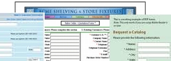


 button.
 button.
 button.
 button.
 button.
 .
. button to complete the addition to your form.
 button for the line to be updated.
 button to complete the line modification.
 button of the line to be deleted.
 button located just above the 'Check Lines' box.
 button is located on every page in the upper right hand corner. If you do not remember